Jetpack compose text fields are highly customizable. Here are 10 things that you can do to give your fields a better look.
- Choose the right TextField for you
- Add labels
- Dowload more Icons and use them
- Use trailing icon
- Use leading icons
- Customize default colors
- Add a visual transformation
- Use shape properties
- Use supporting text
- Use placeholders
1. Choose the right TextField for you
You can choose between TextField, BasicTextField, and OutlinedTextField. Personally I prefer OutlinerTextField, but if you want a minimalist design TextField is better. This is an example of them:
Column(modifier = Modifier.padding(50.dp)) {
    TextField(value = "TextField", onValueChange = {} )
    Spacer(Modifier.height(50.dp))
    BasicTextField(value = "BasicTextField", onValueChange =  {})
    Spacer(Modifier.height(50.dp))
    OutlinedTextField(value = "OutlinedTextField", onValueChange = {} )
}

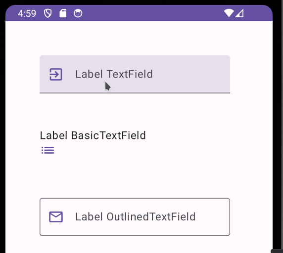
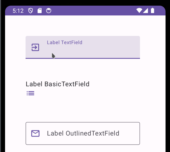
2. Add labels
Sounds obvious, but the use of labels it is indispensable, dont forget it. In the case of BasicTextField, it does not have label property, so you have to use a Text Composable for it.
var text by remember { mutableStateOf("") }

  Column(modifier = Modifier.padding(50.dp)) {
      TextField(
          value = text,
          onValueChange = {text = it},
          label = { Text("Label TextField") }
      )

      Spacer(Modifier.height(50.dp))

      Text("Label BasicTextField")
      BasicTextField(
          value = text,
          onValueChange = {text = it},
      )

      Spacer(Modifier.height(50.dp))

      OutlinedTextField(
          value = text,
          onValueChange = {text = it},
          label = { Text("Label OutlinedTextField") }
      )
  }
3. Dowload more Icons and use them
There is special dependency for the extended icon pack. Just add this line to your dependencies (replace the number version)
dependencies {
  implementation("androidx.compose.material:material-icons-extended:1.5.4")

  // Omitted code
}
You can have a preview of the icons in the page:
https://petershaggynoble.github.io/MDI-Sandbox/extended/

4. Use trailing icon
Both OutlinedTextField and TextField have trailingIcon property. BasicTextField does not have so you have to do it manually.
var text by remember { mutableStateOf("") }

Column(modifier = Modifier.padding(50.dp)) {
    TextField(
        value = text,
        onValueChange = {text = it},
        label = { Text("Label TextField") },
        trailingIcon = { // Trailing Icon
            Icon(Icons.Default.Check, "Correct", tint = Color.Green)
        }
    )

    Spacer(Modifier.height(50.dp))

    Text("Label BasicTextField")
    Row() {
        BasicTextField(
            modifier = Modifier.fillMaxWidth(0.9f),
            value = text,
            onValueChange = {text = it},
        )// Trailing Icon
        Icon(Icons.Default.Info, "Info", tint = Color.Blue)
    }

    Spacer(Modifier.height(50.dp))

    OutlinedTextField(
        value = text,
        onValueChange = {text = it},
        label = { Text("Label OutlinedTextField") },
        trailingIcon = { // Trailing Icon
            Icon(Icons.Default.Close, "Wrong", tint = Color.Red)
        }
    )
}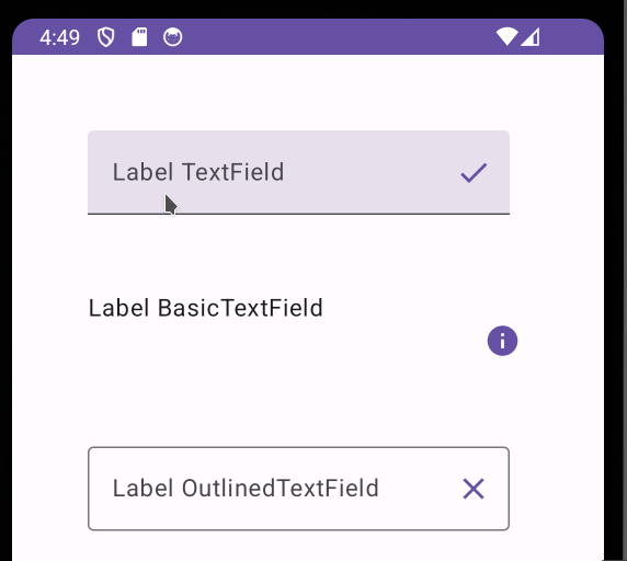
5. Use leading icon
var text by remember { mutableStateOf("") }

  Column(modifier = Modifier.padding(50.dp)) {
      TextField(
          value = text,
          onValueChange = { text = it },
          label = { Text("Label TextField") },
          leadingIcon = { // Leading Icon
              Icon(
                  Icons.Default.ExitToApp,
                  "ExitToApp",
                  tint = MaterialTheme.colorScheme.primary
              )
          }
      )

      Spacer(Modifier.height(50.dp))

      Text("Label BasicTextField")
      Row() {
          Icon( // Leading Icon
              Icons.Default.List,
              "List",
              tint = MaterialTheme.colorScheme.primary
          )
          BasicTextField(
              modifier = Modifier.fillMaxWidth(0.9f),
              value = text,
              onValueChange = { text = it },
          )
      }

      Spacer(Modifier.height(50.dp))

      OutlinedTextField(
          value = text,
          onValueChange = { text = it },
          label = { Text("Label OutlinedTextField") },
          leadingIcon = { // Leading Icon
              Icon(
                  Icons.Default.MailOutline,
                  "MailOutline",
                  tint = MaterialTheme.colorScheme.primary
              )
          }
      )
  }
6. Customize default colors
You can change font color, container color, error colors, etc. Let’s see an example with text colors.
var text by remember { mutableStateOf("") }

Column(modifier = Modifier.padding(50.dp)) {
    TextField(
        value = text,
        onValueChange = { text = it },
        label = { Text("Label TextField") },
        leadingIcon = {
            Icon(
                Icons.Default.ExitToApp,
                "ExitToApp",
                tint = MaterialTheme.colorScheme.primary
            )
        },
        colors = TextFieldDefaults.textFieldColors( // Default colors changed
            textColor = MaterialTheme.colorScheme.secondary
        )
    )

    Spacer(Modifier.height(50.dp))

    Text("Label BasicTextField")
    Row(verticalAlignment = Alignment.CenterVertically) {
        Icon(
            Icons.Default.List,
            "List",
            tint = MaterialTheme.colorScheme.primary
        )
        Spacer(Modifier.height(25.dp))
        BasicTextField(
            value = text,
            onValueChange = { text = it },
            textStyle = LocalTextStyle.current.copy( // Default colors changed
            color = MaterialTheme.colorScheme.secondary
            )
        )
    }

    Spacer(Modifier.height(50.dp))

    OutlinedTextField(
        value = text,
        onValueChange = { text = it },
        label = { Text("Label OutlinedTextField") },
        leadingIcon = {
            Icon(
                Icons.Default.MailOutline,
                "MailOutline",
                tint = MaterialTheme.colorScheme.primary
            )
        },
        colors = TextFieldDefaults.outlinedTextFieldColors( // Default colors changed
            textColor = MaterialTheme.colorScheme.secondary
        )
    )
}
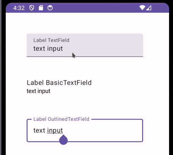
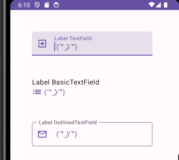
7. Add a visual transformation
With visual transformations you can customize the way the text looks. This is mostly used when you want to give numerical, currency or phone format to your text. Let’s see an example putting an ascci face right of the text.
You have to create a class like this:
private class EmojiTransformation : VisualTransformation {
    override fun filter(text: AnnotatedString): TransformedText {
        val originalText = text.text.trim()
        val text = "$originalText ( ͡° ͜ʖ ͡°)" //Here I change the text

        val offset = object : OffsetMapping {
            override fun originalToTransformed(offset: Int): Int {
                return offset
            }

            override fun transformedToOriginal(offset: Int): Int {
                if (offset <= 0) return offset
                if (offset > originalText.length) {
                    return originalText.length
                }
                return offset
            }
        }
        return TransformedText(AnnotatedString(text), offset)
    }
}
var text by remember { mutableStateOf("") }
Column(modifier = Modifier.padding(50.dp)) {
TextField(
value = text,
onValueChange = { text = it },
label = { Text("Label TextField") },
leadingIcon = {
Icon(
Icons.Default.ExitToApp,
"ExitToApp",
tint = MaterialTheme.colorScheme.primary
)
},
colors = TextFieldDefaults.textFieldColors(
textColor = MaterialTheme.colorScheme.secondary
),
visualTransformation = EmojiTransformation() //Visual transformation
)
Spacer(Modifier.height(50.dp))
Text("Label BasicTextField")
Row(verticalAlignment = Alignment.CenterVertically) {
Icon(
Icons.Default.List,
"List",
tint = MaterialTheme.colorScheme.primary
)
Spacer(Modifier.height(25.dp))
BasicTextField(
value = text,
onValueChange = { text = it },
textStyle = LocalTextStyle.current.copy(color = MaterialTheme.colorScheme.secondary ),
visualTransformation = EmojiTransformation() //Visual transformation
)
}
Spacer(Modifier.height(50.dp))
OutlinedTextField(
value = text,
onValueChange = { text = it },
label = { Text("Label OutlinedTextField") },
leadingIcon = {
Icon(
Icons.Default.MailOutline,
"MailOutline",
tint = MaterialTheme.colorScheme.primary
)
},
colors = TextFieldDefaults.outlinedTextFieldColors(
textColor = MaterialTheme.colorScheme.secondary
),
visualTransformation = EmojiTransformation() //Visual transformation
)
}
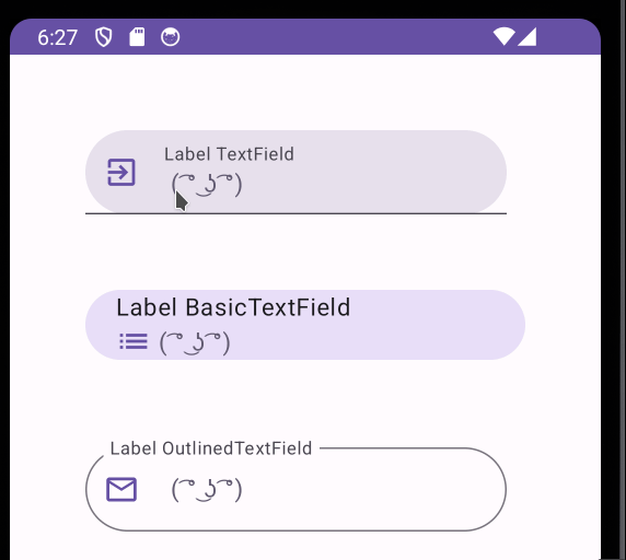
8. Use shape properties
You can customize the shape of the text field, it can be a rounded square, a rectangle or a circle. Lets see an example with Circle Shape.
var text by remember { mutableStateOf("") }

Column(modifier = Modifier.padding(50.dp)) {
    TextField(
        value = text,
        onValueChange = { text = it },
        label = { Text("Label TextField") },
        leadingIcon = {
            Icon(
                Icons.Default.ExitToApp,
                "ExitToApp",
                tint = MaterialTheme.colorScheme.primary
            )
        },
        colors = TextFieldDefaults.textFieldColors(
            textColor = MaterialTheme.colorScheme.secondary
        ),
        visualTransformation = EmojiTransformation(),
        shape = CircleShape  //Circle shape
    )

    Spacer(Modifier.height(50.dp))

    Column(modifier = Modifier.fillMaxWidth()
        .clip(CircleShape) //Circle shape
        .background(MaterialTheme.colorScheme.secondaryContainer)
        .padding(start = 20.dp)
        ) {
        Text("Label BasicTextField")
        Row(
            verticalAlignment = Alignment.CenterVertically,
        ) {
            Icon(
                Icons.Default.List,
                "List",
                tint = MaterialTheme.colorScheme.primary
            )
            Spacer(Modifier.height(25.dp))
            BasicTextField(
                value = text,
                onValueChange = { text = it },
                textStyle = LocalTextStyle.current.copy(color = MaterialTheme.colorScheme.secondary),
                visualTransformation = EmojiTransformation() //Circle shape

            )
        }
    }


    Spacer(Modifier.height(50.dp))

    OutlinedTextField(
        value = text,
        onValueChange = { text = it },
        label = { Text("Label OutlinedTextField") },
        leadingIcon = {
            Icon(
                Icons.Default.MailOutline,
                "MailOutline",
                tint = MaterialTheme.colorScheme.primary
            )
        },
        colors = TextFieldDefaults.outlinedTextFieldColors(
            textColor = MaterialTheme.colorScheme.secondary
        ),
        visualTransformation = EmojiTransformation(),
        shape = CircleShape
    )
  }
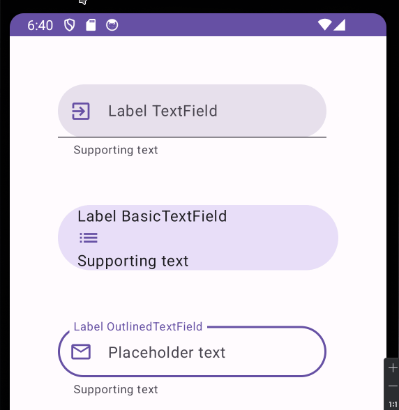
9. Use supporting text
Supporting text is a description below the text field. It can be helpful for the user.
var text by remember { mutableStateOf("") }

Column(modifier = Modifier.padding(50.dp)) {
    TextField(
        value = text,
        onValueChange = { text = it },
        label = { Text("Label TextField") },
        leadingIcon = {
            Icon(
                Icons.Default.ExitToApp,
                "ExitToApp",
                tint = MaterialTheme.colorScheme.primary
            )
        },
        colors = TextFieldDefaults.textFieldColors(
            textColor = MaterialTheme.colorScheme.secondary
        ),
        visualTransformation = EmojiTransformation(),
        shape = CircleShape,
        supportingText = {Text("Supporting text")} //Supporting text
    )

    Spacer(Modifier.height(50.dp))

    Column(modifier = Modifier.fillMaxWidth()
        .clip(CircleShape)
        .background(MaterialTheme.colorScheme.secondaryContainer)
        .padding(start = 20.dp)
        ) {
        Text("Label BasicTextField")
        Row(
            verticalAlignment = Alignment.CenterVertically,
        ) {
            Icon(
                Icons.Default.List,
                "List",
                tint = MaterialTheme.colorScheme.primary
            )
            Spacer(Modifier.height(25.dp))
            BasicTextField(
                value = text,
                onValueChange = { text = it },
                textStyle = LocalTextStyle.current.copy(color = MaterialTheme.colorScheme.secondary),
                visualTransformation = EmojiTransformation()

            )
        }
        Text("Supporting text") //Supporting text
    }


    Spacer(Modifier.height(50.dp))

    OutlinedTextField(
        value = text,
        onValueChange = { text = it },
        label = { Text("Label OutlinedTextField") },
        leadingIcon = {
            Icon(
                Icons.Default.MailOutline,
                "MailOutline",
                tint = MaterialTheme.colorScheme.primary
            )
        },
        colors = TextFieldDefaults.outlinedTextFieldColors(
            textColor = MaterialTheme.colorScheme.secondary
        ),
        visualTransformation = EmojiTransformation(),
        shape = CircleShape,
        supportingText = {Text("Supporting text")} //Supporting text
    )
}
10. Use placeholders
Placeholders are descriptive text that the user can see before he start typing.
var text by remember { mutableStateOf("") }

Column(modifier = Modifier.padding(50.dp)) {
    TextField(
        value = text,
        onValueChange = { text = it },
        label = { Text("Label TextField") },
        leadingIcon = {
            Icon(
                Icons.Default.ExitToApp,
                "ExitToApp",
                tint = MaterialTheme.colorScheme.primary
            )
        },
        colors = TextFieldDefaults.textFieldColors(
            textColor = MaterialTheme.colorScheme.secondary
        ),
        visualTransformation = EmojiTransformation(),
        shape = CircleShape,
        supportingText = {Text("Supporting text")},
        placeholder ={Text("Placeholder text")}
    )

    Spacer(Modifier.height(50.dp))

    Column(modifier = Modifier.fillMaxWidth()
        .clip(CircleShape)
        .background(MaterialTheme.colorScheme.secondaryContainer)
        .padding(start = 20.dp)
        ) {
        Text("Label BasicTextField")
        Row(
            verticalAlignment = Alignment.CenterVertically,
        ) {
            Icon(
                Icons.Default.List,
                "List",
                tint = MaterialTheme.colorScheme.primary
            )
            Spacer(Modifier.height(25.dp))
            BasicTextField(
                value = text,
                onValueChange = { text = it },
                textStyle = LocalTextStyle.current.copy(color = MaterialTheme.colorScheme.secondary),
                visualTransformation = EmojiTransformation()

            )
        }
        Text("Supporting text")
    }


    Spacer(Modifier.height(50.dp))

    OutlinedTextField(
        value = text,
        onValueChange = { text = it },
        label = { Text("Label OutlinedTextField") },
        leadingIcon = {
            Icon(
                Icons.Default.MailOutline,
                "MailOutline",
                tint = MaterialTheme.colorScheme.primary
            )
        },
        colors = TextFieldDefaults.outlinedTextFieldColors(
            textColor = MaterialTheme.colorScheme.secondary
        ),
        visualTransformation = EmojiTransformation(),
        shape = CircleShape,
        supportingText = {Text("Supporting text")},
        placeholder ={Text("Placeholder text")}
    )
}