A common functionality in a mobile app is allowing users to choose a color. Sometimes, you need a composable according to these needs
- A field where to place the description of the colors
- A dialog to choose the color
For the dialog, we are going to use the library in this github repo:
https://github.com/maxkeppeler/sheets-compose-dialogs/tree/main
First, lets add the dependencies of the library
implementation("com.maxkeppeler.sheets-compose-dialogs:core:1.2.0")
implementation("com.maxkeppeler.sheets-compose-dialogs:color:1.2.0")
In the github repo there are many examples for color dialogs, so lets try the next one
@OptIn(ExperimentalMaterial3Api::class)
@Composable
fun ColorPicker() {
    val color = remember { mutableStateOf(Color.Red.toArgb()) }
    ColorDialog(
        state = rememberUseCaseState(visible = true, onCloseRequest = { }),
        selection = ColorSelection(
            selectedColor = SingleColor(color.value),
            onSelectColor = { color.value = it },
        ),
        config = ColorConfig(
            defaultDisplayMode = ColorSelectionMode.CUSTOM,
            allowCustomColorAlphaValues = false
        ),
    )
}
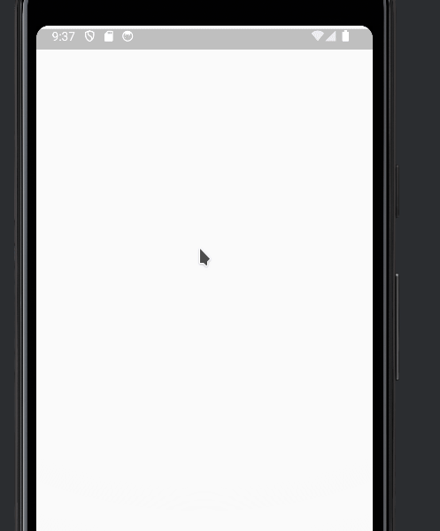
This is how it looks like
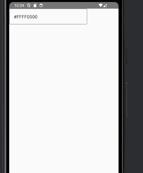
Next, we add a textfield for the description
 OutlinedTextField(
        value = "#${color.value.toHexString().uppercase()}",
        onValueChange = {}
  )
And we add the events to open the dialog. We want that the dialog opens when the TextField is clicked. We add a state variable for this
val open = remember { mutableStateOf(false) }And we implement the click event
OutlinedTextField(
        modifier = Modifier.clickable { open.value = true },
        value = "#${color.value.toHexString().uppercase()}",
        onValueChange = {}
    )
You will notice that the click event does not work. You need to add the enable=false attribute and fix the colors.
OutlinedTextField(
        enabled = false, // Add this to make click event work
        modifier = Modifier.clickable { open.value = true },
        value = "#${color.value.toHexString().uppercase()}",
        onValueChange = {},
        colors = OutlinedTextFieldDefaults.colors( // Fixing the colors
            disabledTextColor = MaterialTheme.colorScheme.onSurface,
            disabledBorderColor = MaterialTheme.colorScheme.outline,
            disabledLeadingIconColor = MaterialTheme.colorScheme.onSurfaceVariant,
            disabledTrailingIconColor = MaterialTheme.colorScheme.onSurfaceVariant,
            disabledLabelColor = MaterialTheme.colorScheme.onSurfaceVariant,
            disabledPlaceholderColor = MaterialTheme.colorScheme.onSurfaceVariant,
        )
    )
We show the dialog only when open.value is true, and we set open.value=false when the dialog is closed
if (open.value) {
        ColorDialog(
            state = rememberUseCaseState(visible = true, onCloseRequest = { open.value = false }),

            selection = ColorSelection(
                selectedColor = SingleColor(color.value),
                onSelectColor = { color.value = it },
            ),
            config = ColorConfig(
                defaultDisplayMode = ColorSelectionMode.CUSTOM,
                allowCustomColorAlphaValues = false
            ),
        )
    }
Finally we add the value and onChange parameters
fun ColorPicker(
    value: Color,
    onChangeValue: (Color) -> Unit
)
And we can use it like this:
@Composable
@Preview
fun ColorPickerPreview() {
    val color = remember {mutableStateOf(Color.Red)}
    AppTheme {
        ColorPicker(
            value = color.value,
            onChangeValue = { color.value = it}
        )
    }
}
This is the whole code
import androidx.compose.foundation.clickable
import androidx.compose.material3.ExperimentalMaterial3Api
import androidx.compose.material3.MaterialTheme
import androidx.compose.material3.OutlinedTextField
import androidx.compose.material3.OutlinedTextFieldDefaults
import androidx.compose.runtime.Composable
import androidx.compose.runtime.mutableStateOf
import androidx.compose.runtime.remember
import androidx.compose.ui.Modifier
import androidx.compose.ui.graphics.Color
import androidx.compose.ui.graphics.toArgb
import androidx.compose.ui.tooling.preview.Preview
import com.maxkeppeker.sheets.core.models.base.rememberUseCaseState
import com.maxkeppeler.sheets.color.ColorDialog
import com.maxkeppeler.sheets.color.models.ColorConfig
import com.maxkeppeler.sheets.color.models.ColorSelection
import com.maxkeppeler.sheets.color.models.ColorSelectionMode
import com.maxkeppeler.sheets.color.models.SingleColor
import com.thisisthetime.controlinversiones.ui.theme.AppTheme
import okhttp3.internal.toHexString


@OptIn(ExperimentalMaterial3Api::class)
@Composable
fun ColorPicker(
    value: Color,
    onChangeValue: (Color) -> Unit
) {
    val open = remember { mutableStateOf(false) }

    OutlinedTextField(
        enabled = false, // Add this to make click event work
        modifier = Modifier.clickable { open.value = true },
        value = "#${value.toArgb().toHexString().uppercase()}",
        onValueChange = {},
        colors = OutlinedTextFieldDefaults.colors( // Fixing the colors
            disabledTextColor = MaterialTheme.colorScheme.onSurface,
            disabledBorderColor = MaterialTheme.colorScheme.outline,
            disabledLeadingIconColor = MaterialTheme.colorScheme.onSurfaceVariant,
            disabledTrailingIconColor = MaterialTheme.colorScheme.onSurfaceVariant,
            disabledLabelColor = MaterialTheme.colorScheme.onSurfaceVariant,
            disabledPlaceholderColor = MaterialTheme.colorScheme.onSurfaceVariant,
        )
    )

    if (open.value) {
        ColorDialog(
            state = rememberUseCaseState(visible = true, onCloseRequest = { open.value = false }),

            selection = ColorSelection(
                selectedColor = SingleColor(value.toArgb()),
                onSelectColor = { onChangeValue(Color(it))},
            ),
            config = ColorConfig(
                defaultDisplayMode = ColorSelectionMode.CUSTOM,
                allowCustomColorAlphaValues = false
            ),
        )
    }

}

@Composable
@Preview
fun ColorPickerPreview() {
    val color = remember {mutableStateOf(Color.Red)}
    AppTheme {
        ColorPicker(
            value = color.value,
            onChangeValue = { color.value = it}
        )
    }
}